

Figma
Panaseer’s product suite had grown rapidly with new modules for risk, compliance, and controls intelligence, causing interface fragmentation. Engineers shipped quickly, but design patterns were duplicated, inconsistencies appeared, and components were not always reusable. The platform’s complexity also revealed gaps in hierarchy, spacing, and interaction behaviors.
The shift to Angular development and modern UI practices made it an ideal moment to rethink how design and engineering could collaborate efficiently.
Context
The existing design system no longer matched the scale or ambition of the product. Several components were outdated, guidance was incomplete, and the visual language felt inconsistent.
A redesign offered a chance to conduct a UI audit, modernize foundations, create consistency, and rebuild the component library aligned with Angular and Material standards, accelerating delivery and unifying teams.
Opportunity
I performed a full audit of every component, module, and screen to reveal patterns and inconsistencies. The audit showed wide variations in spacing, typography, iconography, color, and interaction logic. Similar components behaved differently, and legacy screens still used outdated styling.
UI Audit
A sampling of disparate styles and components from our previous design system.Rather than starting from scratch, I evolved the existing system into a structured design language. Typography, spacing, grids, colors, and motion were consolidated into a refined token architecture, making the product cohesive and scalable.
Each token and component was mapped to Angular and Material specifications, creating a clear bridge between design and development.
A Reimagined System
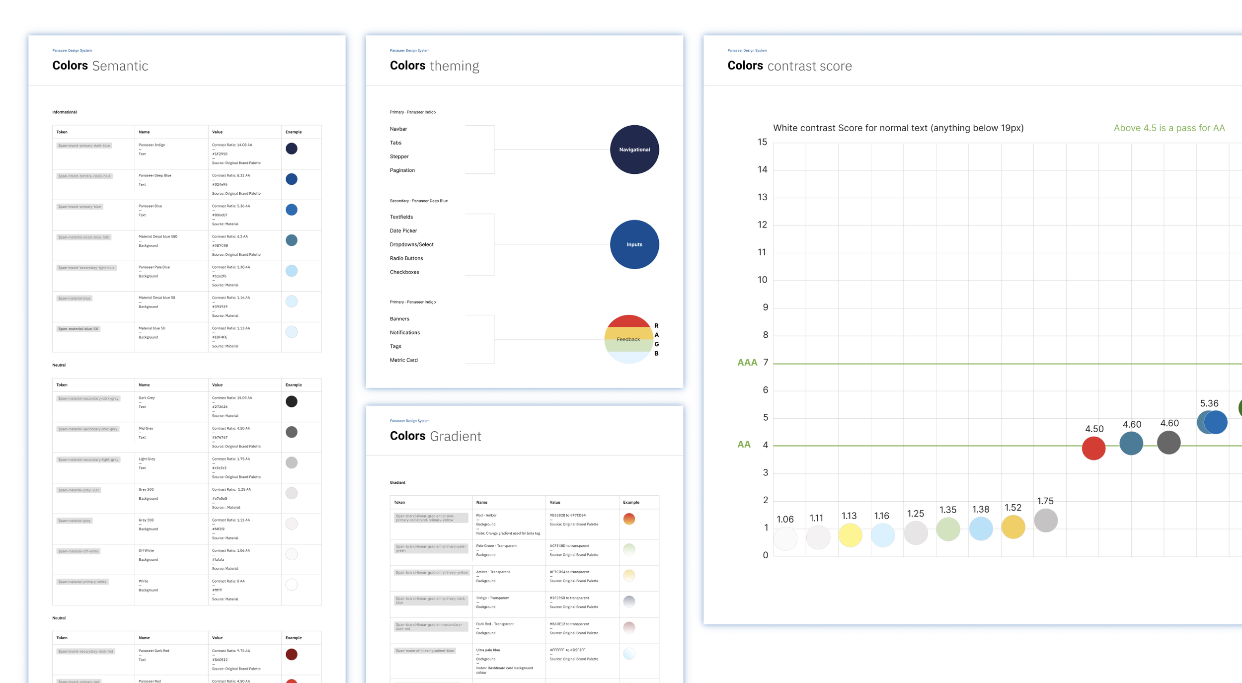
A sampling of disparate styles and components from our previous design system.The audit identified areas for modernization. Typography was adjusted for hierarchy and readability, colors refined for accessibility and a Panaseer aesthetic, and iconography unified.
Motion guidelines added clarity to workflows and micro interactions, making data-heavy tasks feel more intuitive. Prototypes demonstrated how risk analysis, asset navigation, and control validation could feel consistent and engaging.
A Visual Revamp
The redesign introduced new components to support expanding capabilities, including dashboards, advanced filters, risk scoring elements, and multi-step wizards.
Components are modular, configurable, and adaptable across modules, enabling scalable, consistent UIs that support rapid feature development.
New Components, Expanded Coverage
Learnings
New way of structure the design system on Figma with the latest features.
Aligning the design system with Angular and Material improves implementation speed and reliability.
Working directly with de developers for a better implementation.
Documentation, examples, and prototypes are essential for adoption.
Governance and collaboration to maintain quality.